WERK12 in Munich
BOAH!
MVRDV
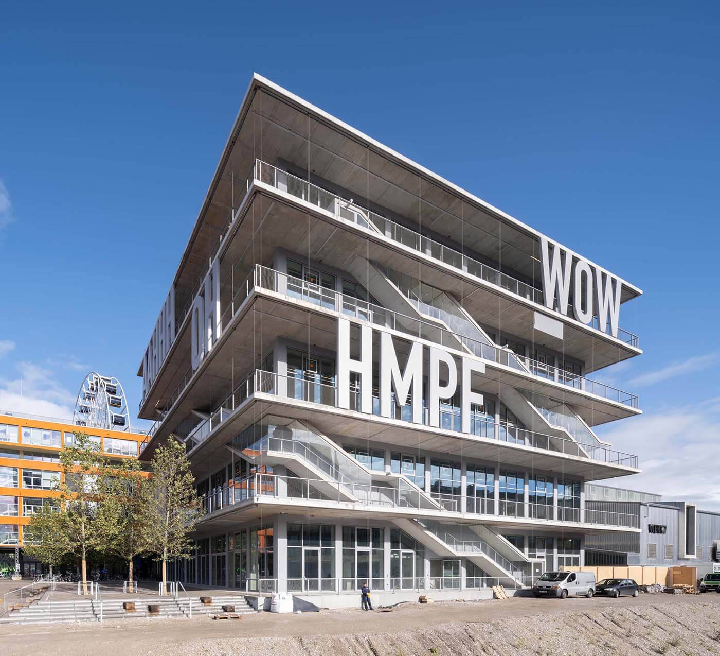
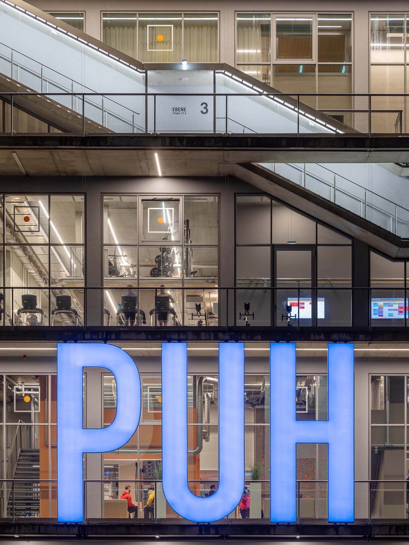
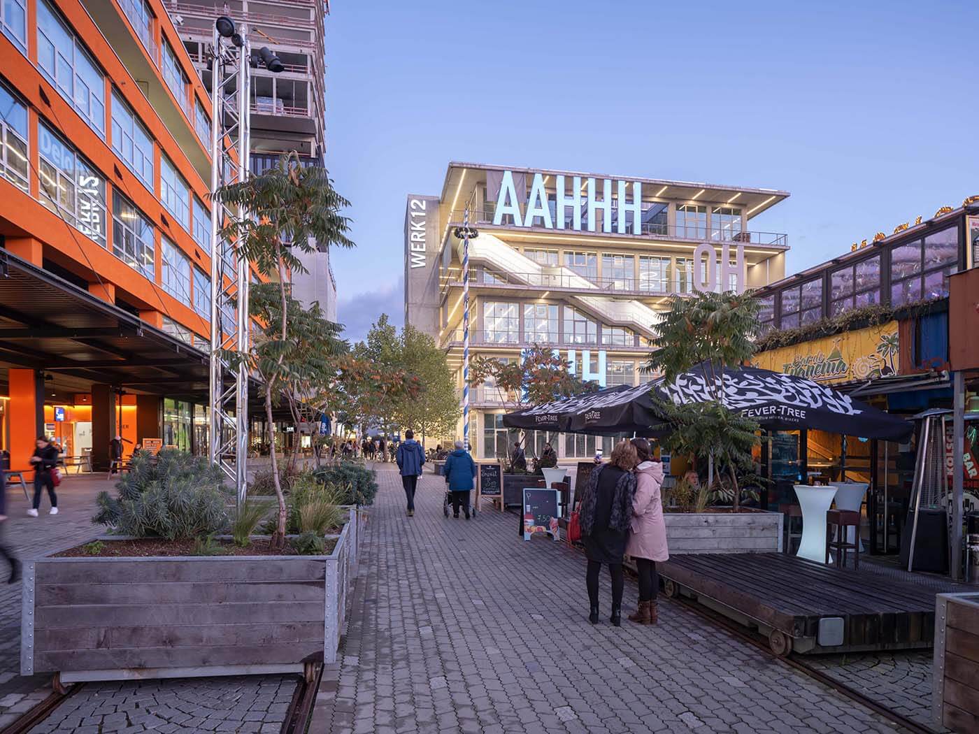
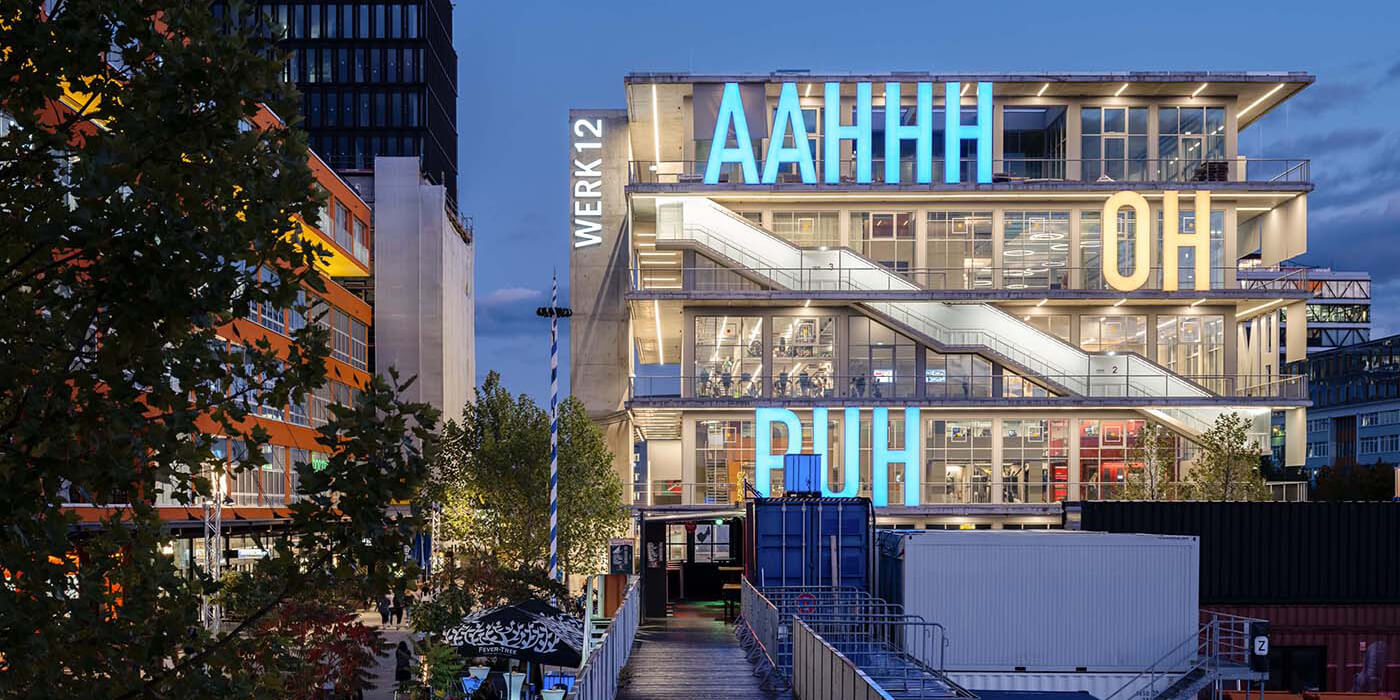
WERK12 immediately catches the eye. This is mainly due to the five-meter-high letters on the façade, which greet us with words of wisdom such as AAHHH, OH and PUH.
AAHHH
WERK12 was built on the former site of the dumpling producer Pfanni in Munich’s Werkviertel district. The five-storey, transparent complex immediately catches the eye. This is mainly due to the five-meter-high letters on the façade, which greet us with words of wisdom such as AAHHH, OH and PUH. But it is also due to the protruding, wrap-around balconies and the external staircases.
The design was created by MVRDV from Rotterdam.
PUH
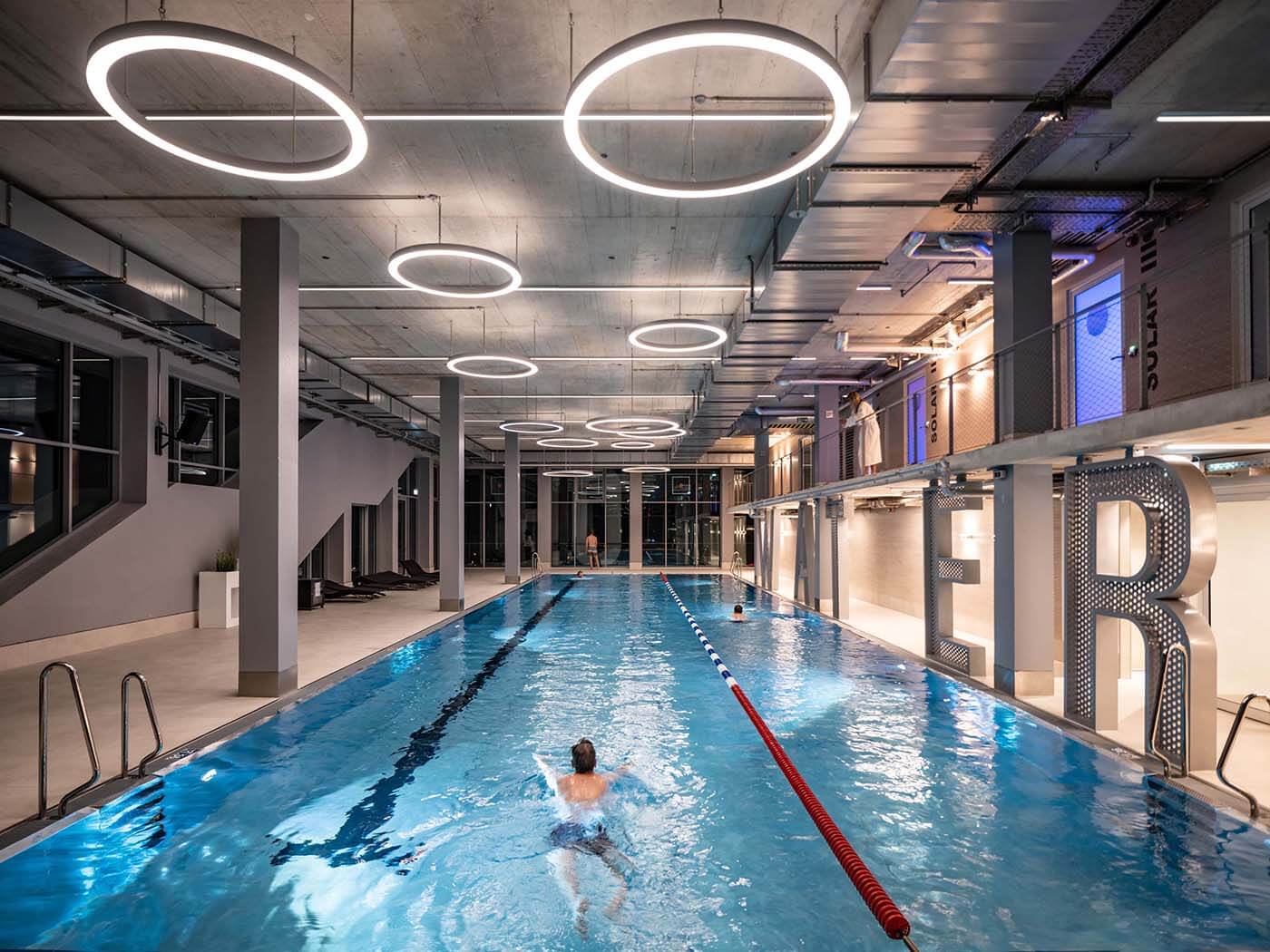
WERK12 offers the fullness of life on five floors: Restaurant and bar on the first floor, offices above and the dominant, three-storey fitness center “body + soul” with its own 25m pool on level 3.
WERK12 is all about flexibility. The high ceilings – 5.5 meters between the individual floors – allow future users to add mezzanines.
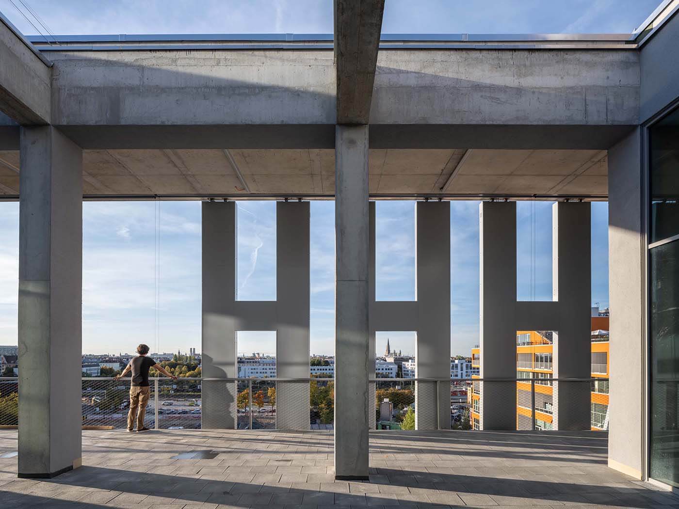
The access core on the north-east side of the building is surrounded on each level by 3.25-metre-wide balconies that soften the distinction between inside and outside. These open spaces are connected by external staircases that wind their way around the building. I guess you could call that design-defining.
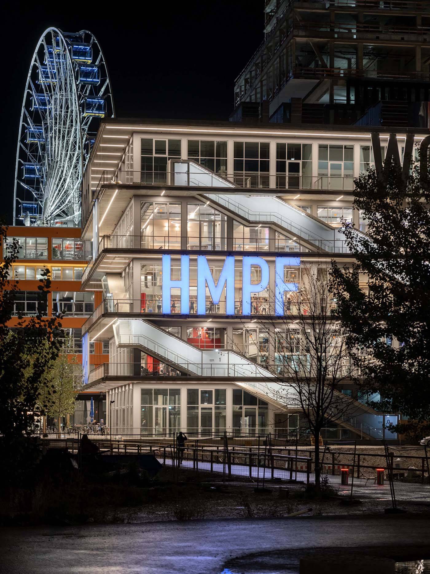
HMPF
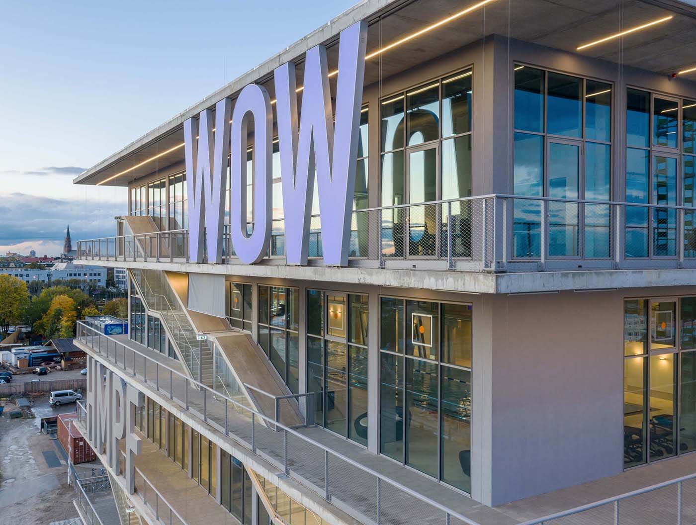
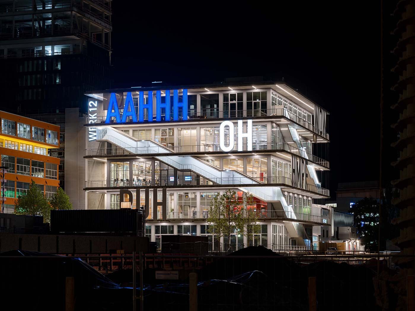
The façade is enlivened by bold, five-meter-high letters. They are the result of a competition organized by the Academy of Fine Arts and MVRDV. The winners, Beate Engl and Christian Engelmann, wanted to depict emotions and be internationally understandable at the same time. They therefore use universally applicable expressions from comics.
The floor-to-ceiling glazing offers a breathtaking view of Munich’s city center the higher up you go.
WERK12 combines the simple square basic shape with honest materials and transparent façades to create a very lively, almost flowing building.
At night, the building’s appearance is almost even more spectacular thanks to its lighting, and its geometry becomes even clearer.


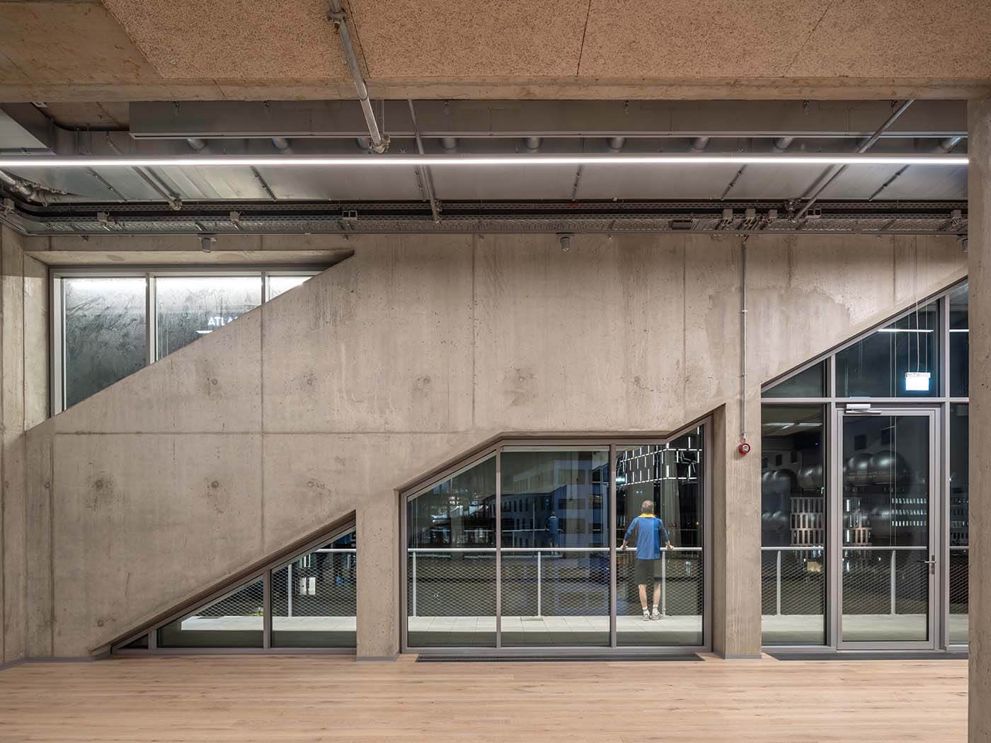
WOW
The area of Munich’s Werksviertel has developed from a dumpling factory into a popular entertainment district. MVRDV’s design does not respect this history, it celebrates it. WERK12 is stylish and cool on the one hand, but doesn’t take itself too seriously on the other. Which is probably why it is exactly that: very, very cool.
Project data
Architect
MVRDV Rotterdam
Achterklooster 7
NL – 3011 RA Rotterdam
Winy Maas, Jacob van Rijs and Nathalie de Vries, Jacob van Rijs, Fokke Moerel, Markus Nagler, Roy Sieljes and Jonathan Schuster, Antonio Luca Coco, Pavlos Ventouris, Kirill Emelianov
N‑V-O Nuyken von Oefele Architects BDA
Winzererstrasse 44
D – 80797 Munich
Building owner
OTEC GmbH & Co. KG
ECKhaus | Atelierstraße 1
D – 81671 Munich
Opening
2019
Address
body + soul Center WERK12
Friedenstraße
D – 81671 Munich
Photos
Ossip van Duivenbode
Halvemaanpassage 103
NL – 3011DL Rotterdam
Text
Johannes Bühlbecker
More Sports Media
Videos
Our categories
Our newsletter
Your stage
Publish your project or product here!