Let the sun shine in
Puig d’en Valls Sports Centre
OMCEA Arquitectura
Essence
The project of the Es Puig d’en Valls Sports Centre was conceived in two distinct phases. The first consisted of the covering of the two existing outdoor courts, the second was the design and realization of the enclosure of its perimeter.
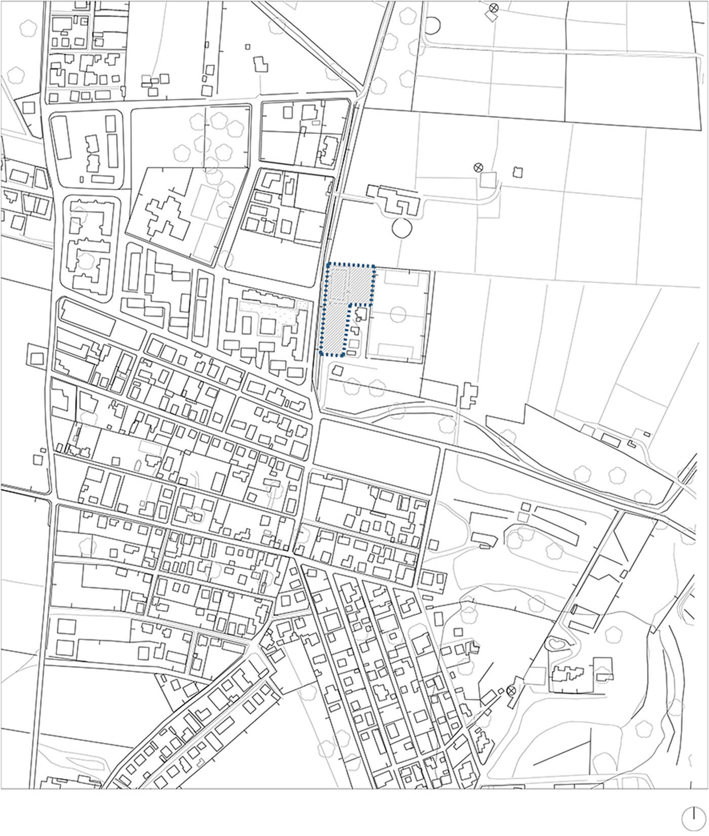
During the realization of the first phase, MCEA Arquitectura received the brief for the design of the enclosure. The main design goal was to achieve an element of fusion between the interior and its broader setting, so as not to lose the essence of the outdoor space for the practice of sports, which had been used as such by teams from Es Puig d’en Valls for years.
Shades of colour
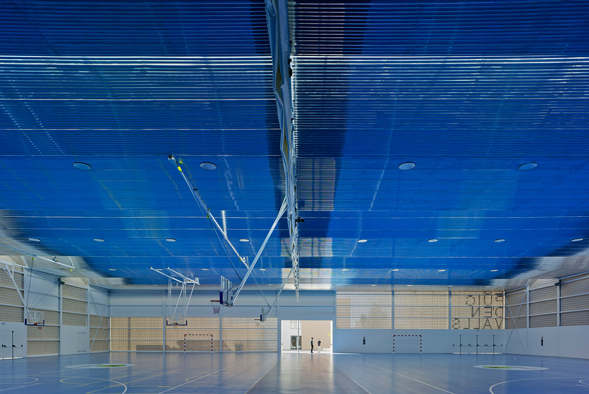
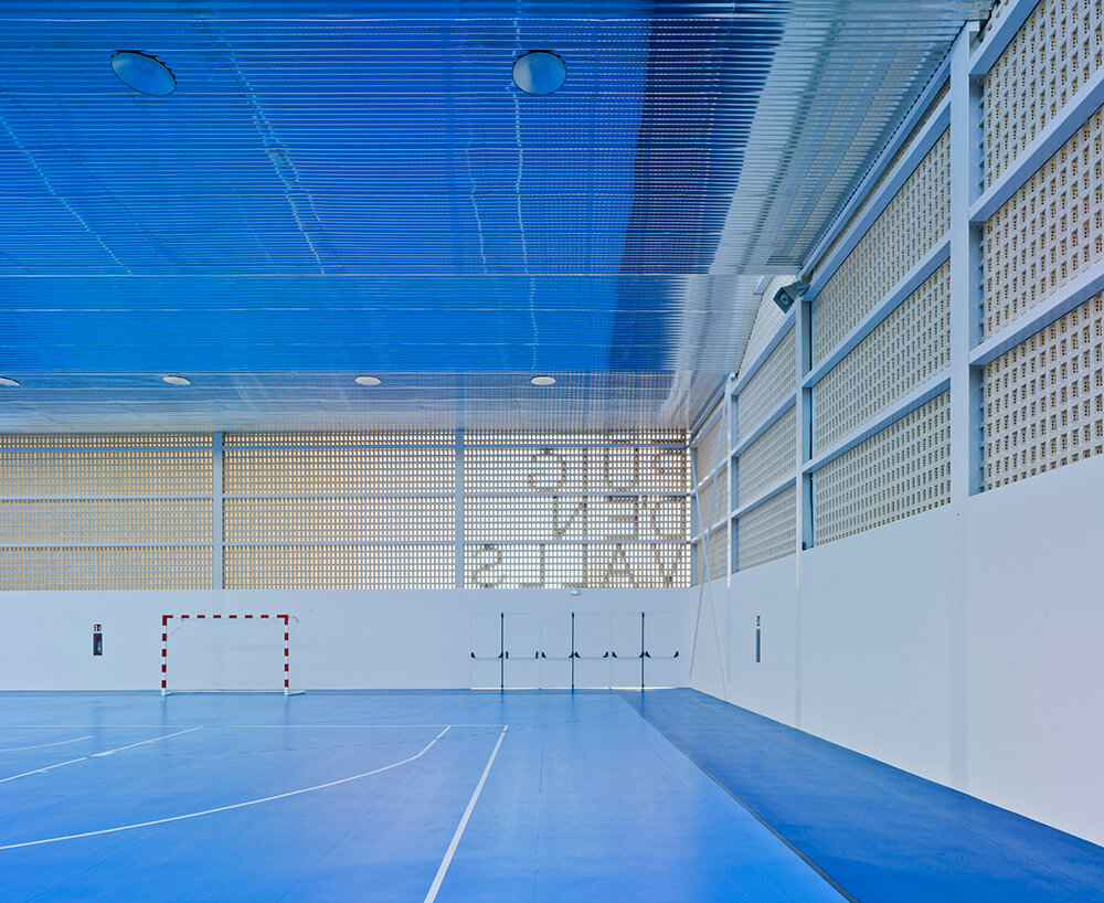
Indeed, it was during the implementation of the first phase of Es Puig d’en Valls Sports Centre that the architects discovered the intensity of the shades of colour that the sun projected onto the building from first light of dawn (due to the absence of obstacles to the east) until dusk. For this reason, the introduction of these fleeting tones of natural light into the newly defined space became a fundamental element of the project, giving continuity in time to the sporting essence of the existing space, which previously was completely open.
Six surfaces
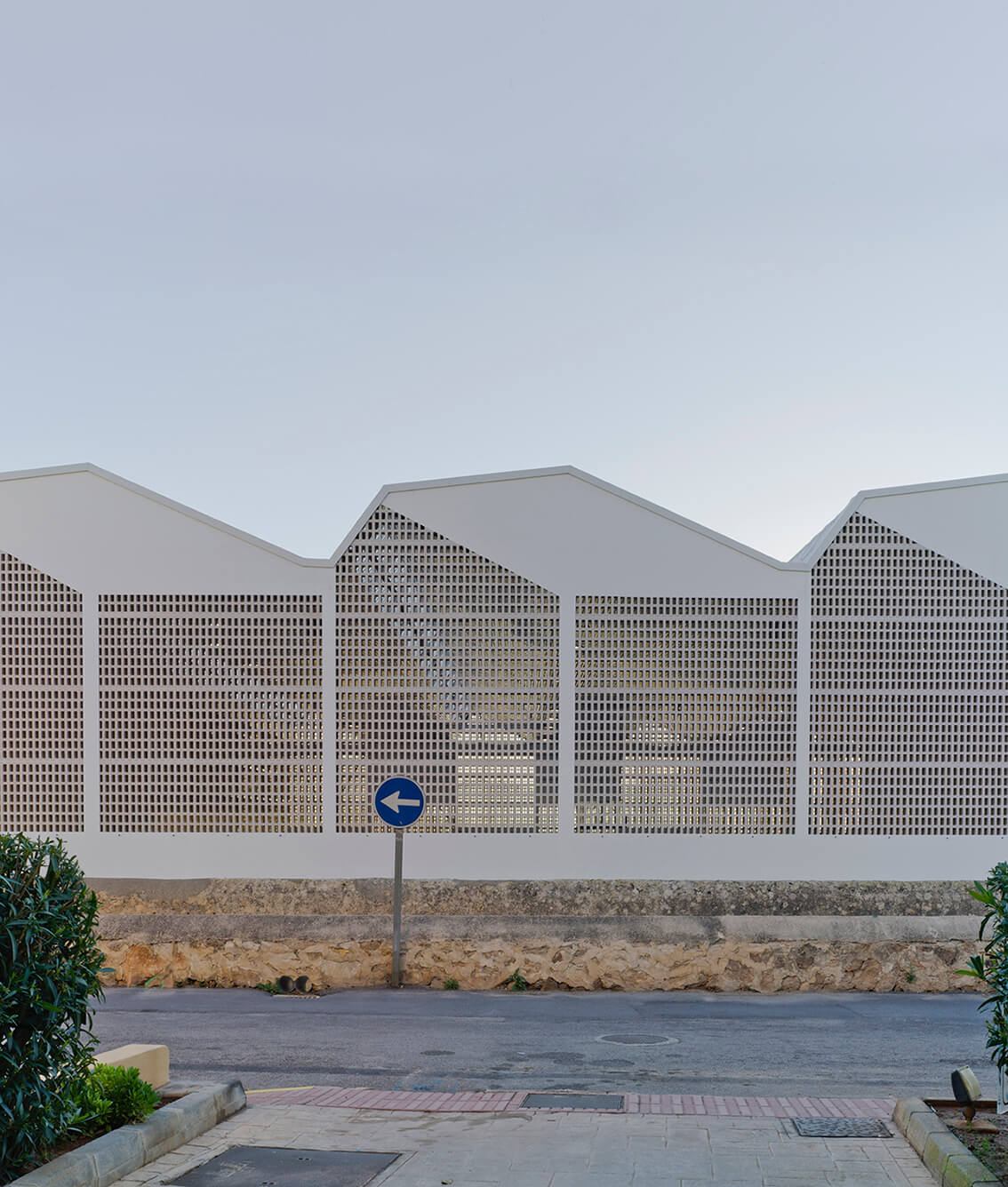
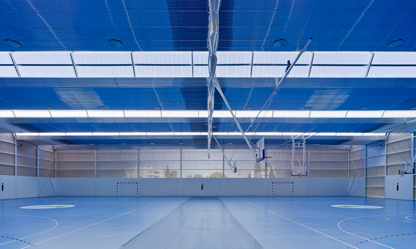
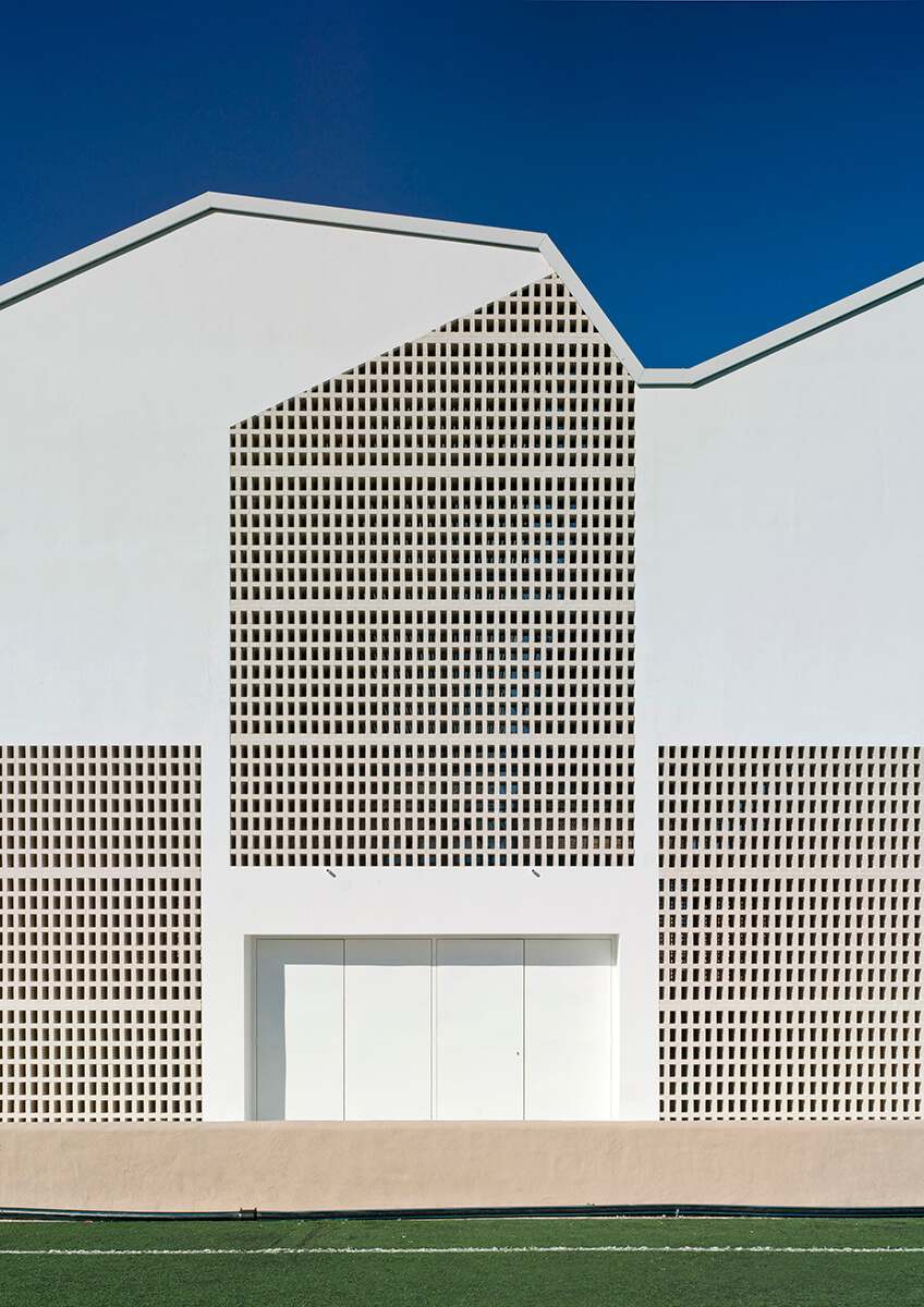
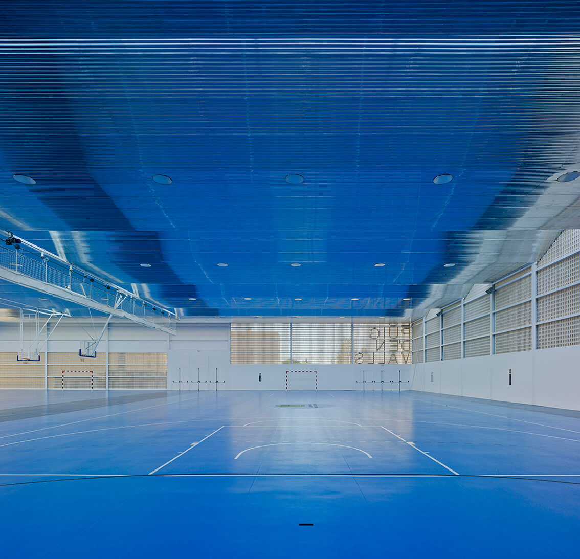
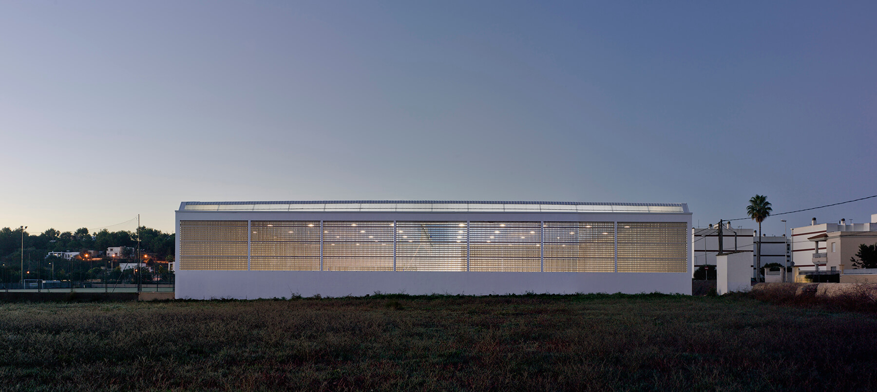
To define the relationship of permanent change between the interior and exterior, MCEA Arquitectura worked with the building’s six surfaces: the ground, introducing a blue colour so evident in the Balearic landscape, the ceiling, of corrugated aluminium, with a reflective capacity providing a fusion of all elements in the development, and the four walls. The walls are materialized through the combination of blind panel walls and lattice walls of 24 cm, exposed white brick with sufficient permeability to allow for the compositional overlapping of two opposing facades and the introduction of the colours of the environment as part of the composition of each of these.
Facades
On the western facade, the lattice panels are aligned according to the horizontal line marked by the stream that runs alongside the building. The eastern facade breaks this linearity to allow for a reflection of the broken lines of the mountainous horizon beyond. The southern facade, which provides the main access, incorporates a lattice fabric in a continuous state of changing colours, and as such constitutes the most representative element of the whole plot. The material selected for the lattice (white open brick), as well as providing notable nuances of colour according to the sun’s position, these ranging from ochre at certain hours of the day to pure whites, allows for the inclusion of a 24cm thick wall which greatly inhibits the entry of water into the enclosure, even in adverse weather conditions.
A close relationship
As a result seeking a close relationship between interior and exterior, the building is able to take full advantage of the prevailing climatic conditions, in order to attain a system of ventilation and natural lighting, and which leads to a level of energy consumption close to zero.
We did this.
Companies involved & Links
Architect
MCEA | Arquitectura
Avda. Teniente Montesinos, 8, Bajo. 30100
ES – Murcia

Address
Es Puig D’en Valls.
Santa Eulària des Riu
ES – Ibiza

Client
City of Puig d’en Valls

Opening
2017

Team
Structure: QL Ingeniería
Surveying: María José González Vicente
Execution Management: José María López Llaquet
Building company: TECOPSA
Photos
David Frutos
Fotografía de Arquitectura

Text
Johannes Bühlbecker, More Sports Madia
Video
Visit our blog
Gammel Hellerup
Simply subterranean.
BasketBar
A milestone in sports facility construction.
Estadio Municipal de Braga
Radical and beautiful. Until today.


